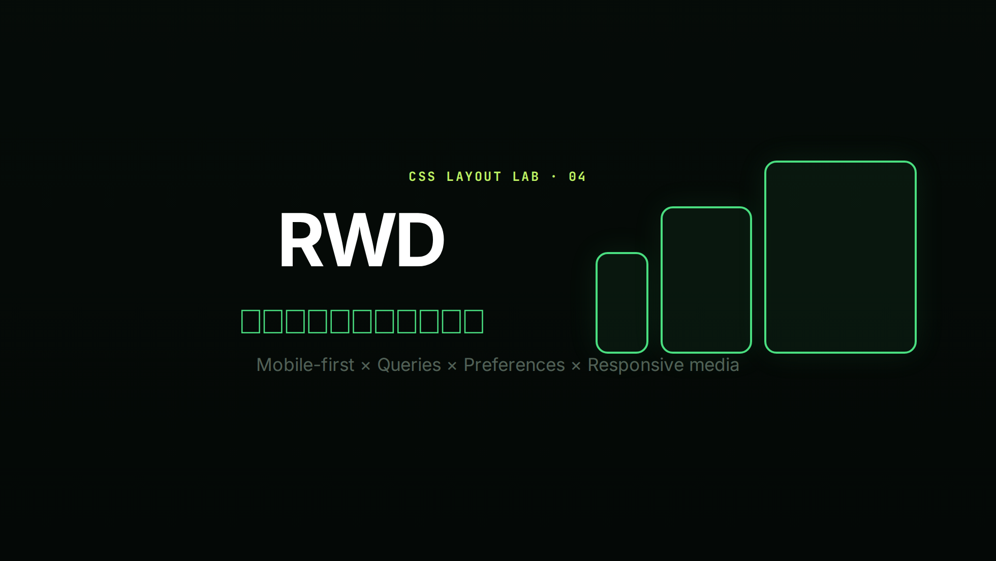
CSS 響應式網頁設計(RWD)
RWD 不是替幾種裝置各做一版,而是讓內容在一段連續尺寸中都能閱讀與操作。本篇統一採 mobile-first:先寫窄版基礎,再用 min-width 或 range syntax 逐步增強。
實作順序
- 正確 viewport
- 流動尺寸與可換行版面
- 內容真的撐不住時才加斷點
- 圖片、偏好設定與互動一起測試
簡報版本
互動實驗室
拖曳預覽寬度,觀察 container query、clamp() 與偏好模擬如何改變卡片。
RWD 實驗室
Viewport 設定
行動瀏覽器若缺少 viewport meta,可能先用較寬的虛擬版面再縮小,導致 media query 與文字尺寸不如預期:
html
<meta name="viewport" content="width=device-width, initial-scale=1">不要加入 user-scalable=no 或過度限制 maximum-scale;使用者需要放大內容。VitePress 通常已提供這項設定,獨立 HTML 頁面則應自行確認。
Mobile-first 基礎
先讓窄版可用,再於內容需要時增加欄位:
css
.cards {
  display: grid;
  grid-template-columns: 1fr;
  gap: 1rem;
}

@media (min-width: 40rem) {
  .cards {
    grid-template-columns: repeat(2, minmax(0, 1fr));
  }
}

@media (min-width: 64rem) {
  .cards {
    grid-template-columns: repeat(3, minmax(0, 1fr));
  }
}
斷點應來自內容:逐步縮放畫面,當行長過長、控制項擠壓或版面失衡時才記錄斷點,不要把裝置名稱當規格。
Media query range syntax
Media Queries Level 4 可用比較運算子,讀法更接近數學:
css
@media (width >= 40rem) {
  /* 40rem 以上 */
}

@media (40rem <= width < 64rem) {
  /* 40rem(含)到 64rem(不含) */
}
傳統 (min-width: 40rem) 仍有效。避免同時寫相鄰的 max-width: 64rem 與 min-width: 64rem,因為邊界可能重疊;range syntax 可清楚表達包含關係。
流動尺寸與 clamp()
不是每個尺寸變化都需要斷點。clamp(min, preferred, max) 可讓值在上下限間連續調整:
css
:root {
  --space-page: clamp(1rem, 4vw, 4rem);
}

h1 {
  font-size: clamp(2rem, 1.4rem + 3vw, 4.5rem);
}

main {
  width: min(100% - 2 * var(--space-page), 70rem);
  margin-inline: auto;
}
字級 preferred 值最好包含 rem 與 viewport 單位,而非只用 vw,以保留縮放行為。
Container queries
Media query 看 viewport;可重用元件更常需要看自己的容器:
css
.card-region {
  container: card / inline-size;
}

.card {
  display: grid;
  gap: 1rem;
}

@container card (width >= 30rem) {
  .card {
    grid-template-columns: 10rem 1fr;
  }
}
可搭配 container query units:
css
.card__title {
  font-size: clamp(1.25rem, 1rem + 2cqi, 2rem);
}
cqi 是 query container inline size 的 1%。沒有合適容器時會依 small viewport 尺寸回退,因此仍要設定合理上下限。
使用者偏好與輸入能力
RWD 也包含環境與偏好,不只是寬度:
css
@media (prefers-reduced-motion: reduce) {
  *,
  *::before,
  *::after {
    scroll-behavior: auto;
    animation-duration: 0.01ms;
    animation-iteration-count: 1;
    transition-duration: 0.01ms;
  }
}

@media (prefers-color-scheme: dark) {
  :root { color-scheme: dark; }
}

@media (prefers-contrast: more) {
  .button { border-width: 2px; }
}

@media (hover: hover) and (pointer: fine) {
  .card:hover { transform: translateY(-2px); }
}
hover 效果不能是取得資訊或操作的唯一方式;觸控裝置可能沒有 hover,鍵盤則需要 :focus-visible。
響應式圖片
只寫 max-width: 100% 能避免溢出,但不會避免手機下載過大的圖片。
同一構圖,不同解析度
html
<img
  src="photo-800.webp"
  srcset="
    photo-480.webp 480w,
    photo-800.webp 800w,
    photo-1600.webp 1600w"
  sizes="(min-width: 64rem) 50vw, 100vw"
  width="1600"
  height="900"
  alt="講者在台上示範 CSS Grid"
>
瀏覽器根據 srcset、sizes、viewport 與像素密度選檔。提供 width、height 可預留比例,降低 layout shift。
不同構圖或格式
html
<picture>
  <source media="(min-width: 48rem)" srcset="wide.webp">
  <source type="image/avif" srcset="portrait.avif">
  <img src="portrait.webp" alt="產品外觀正面照">
</picture>
picture 適合 art direction 或格式選擇;alt 放在 img 上並描述內容,不描述「圖片」本身。
韌性細節
css
img, video {
  max-width: 100%;
  height: auto;
}

.row {
  display: flex;
  flex-wrap: wrap;
  gap: 0.75rem;
}

.text {
  overflow-wrap: anywhere;
}- 避免固定高度包住可換行文字。
- 測試 200% 文字縮放、320 CSS px 寬度與橫向模式。
- 觸控目標要有足夠尺寸與間距。
- 不要依 CSS 視覺重排破壞 DOM、Tab 與閱讀順序。
練習
- 將單欄卡片在內容需要時增強為兩欄,全程只用 mobile-first。
- 用 range syntax 寫出
40rem ≤ width < 64rem。 - 讓 card 依容器而非 viewport 切換圖文排列。
- 為 hero 圖加入
srcset、sizes、固有寬高與有意義 alt。
FAQ
- 斷點要用 px 還是 rem? 兩者皆可;
rem常能更貼近使用者字級設定。重點是由內容決定並一致使用。 - Container query 可取代 media query 嗎? 不完全。頁面級環境用 media query;元件局部版面用 container query。
- mobile-first 是否一定較快? 不保證效能,但 cascade 通常較清楚;網路效能仍要處理圖片、字型與 JavaScript。